Clearly Kombucha · Brand Revamp
Trading wellness clichés for attitude, for Molson Coors' first non-alcoholic acquisition
Account Director
Brand
AREA6, Mexico
The Problem Worth Solving
Molson Coors had just acquired Clearly Kombucha, its first non-alcoholic beverage brand in the U.S. market. The category was crowded and homogenous. Every kombucha brand on shelf was making the same pitch: gut health, probiotics, clean living. None of it was differentiated. The acquisition needed a brand that could stand out in a category built entirely around virtue, and a relaunch across two markets, U.S. and Canada, at the same time.
The Insight That Unlocked It
Health was the category's default language, which meant it was nobody's advantage. The opening wasn't a better wellness claim. It was refusing to make one at all. Kombucha drinkers didn't need convincing the drink was good for them; they needed a brand that didn't sound like medicine. Attitude and lifestyle, not virtue, was the gap nobody else in the category was occupying.
What I Did
I led the rebranding process for Area6, overseeing both the creative output and the digital strategy through to launch:
Directed the brand repositioning from category-standard wellness language to attitude-led, lifestyle-driven positioning
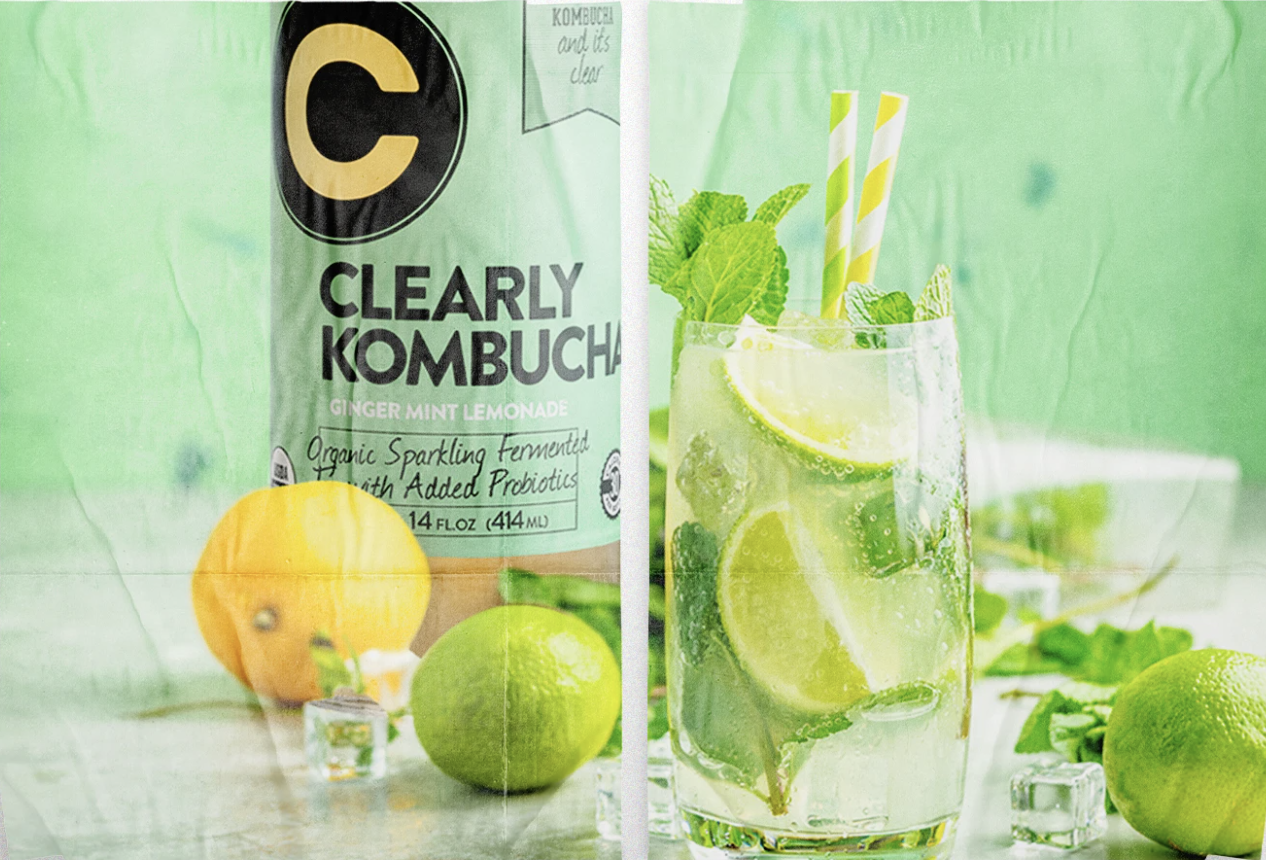
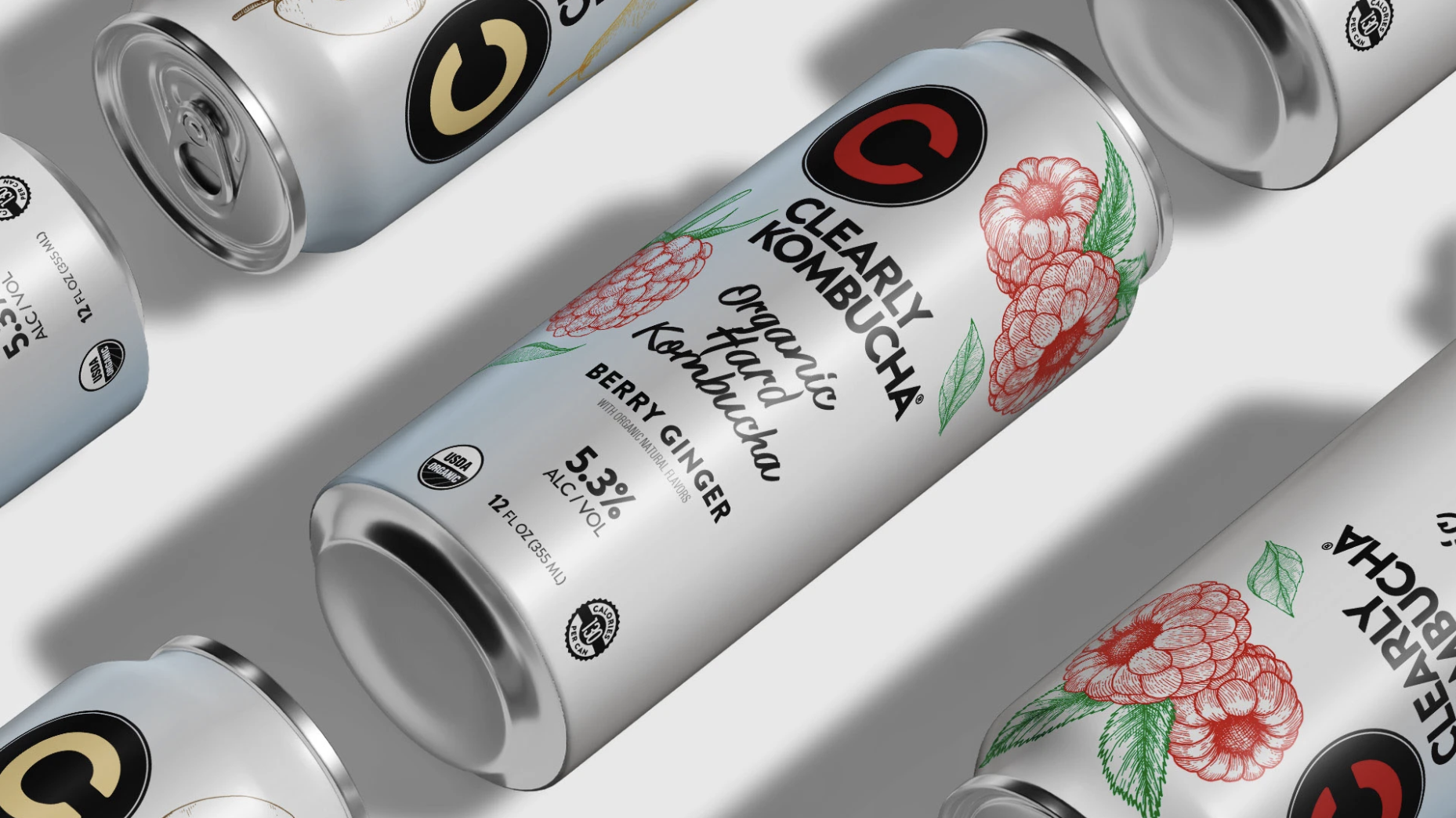
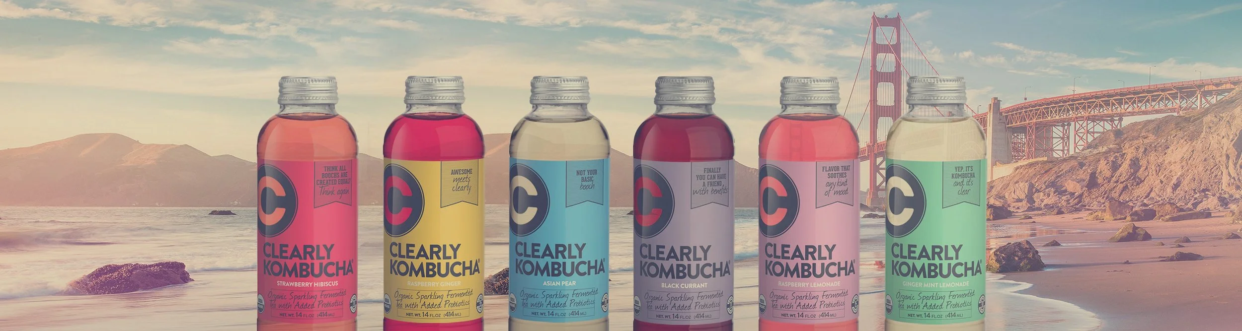
Oversaw the new logo, tagline, and packaging redesign across six flavours, plus box design, for the full materials set needed in U.S. and Canadian stores, including Hard Kombucha.
Coordinated the packaging redesign across both markets to keep the identity consistent
Led the revamp of the website's UX/UI to reflect the new identity and consumer journey
Developed the social media strategy to reintroduce the brand within the category
Ensured the new brand guidelines and tone of voice carried through consistently across every channel
The Idea It Became
The new voice swapped wellness language for outright swagger. Lines like "Freaking awesome," "Awesomeness starter," and "You deserve amazing" replaced the category's usual talk of gut health and clean living. The same attitude ran through a video series built around the things people actually cared about when they picked up a drink, calories, flavour, clarity, treated with a wink rather than a lecture.
It carried through to the point of sale too: in-store banners and door decals brought the same tone of voice off-screen and onto shelf, so the personality didn't stop at digital.