Sanofi RX - Plitican
Re-branding an anti-emetic to make relief the whole storY
LATAM & EMEA Strategic Account Executive
Monks, México
The Problem Worth Solving
Plitican (Alizaprida) treats nausea and vomiting in some of the patients who need relief most urgently: people recovering from surgery, and people going through chemotherapy. Sanofi's sales force knew the science worked. What they didn't have was a brand that made the case for them. Plitican's identity was generic enough that reps had nothing distinctive to put in front of doctors, and nothing memorable to leave behind with the patients and caregivers who'd ultimately buy it.
The Insight That Unlocked It
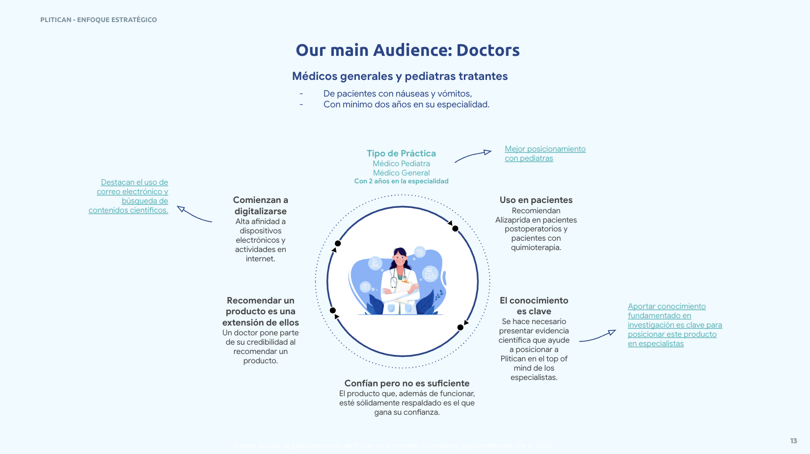
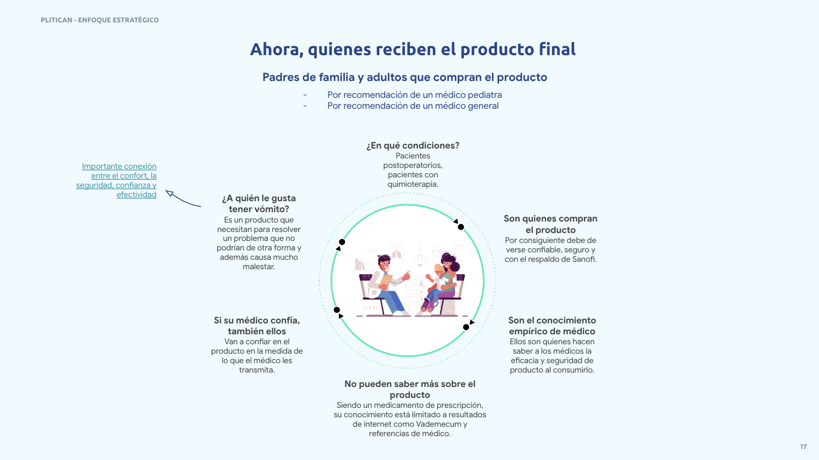
The brief wasn't really about a logo. It was about three different audiences who needed to trust the same product for three different reasons, in sequence: the doctor who has to risk their professional credibility recommending it, the remote sales rep who has to represent Sanofi convincingly without being a clinician themselves, and the patient or parent who has no medical literacy to fall back on and is simply hoping to stop feeling wretched. Each one needed the brand to do something slightly different, but all three needed the same underlying promise: this is going to help, and you can trust that it will.
So the work started with the audience, not the artwork. Building out each group's relationship to the product (their access to information, their stake in recommending or using it, their limited time and attention) before deciding what the brand should look or sound like.
What I Did
I helped develop the strategic foundation the design system would sit on:
💊 Mapped three distinct audiences (prescribing physicians, remote sales reps, patients and caregivers) and what each one needed from the brand to trust it
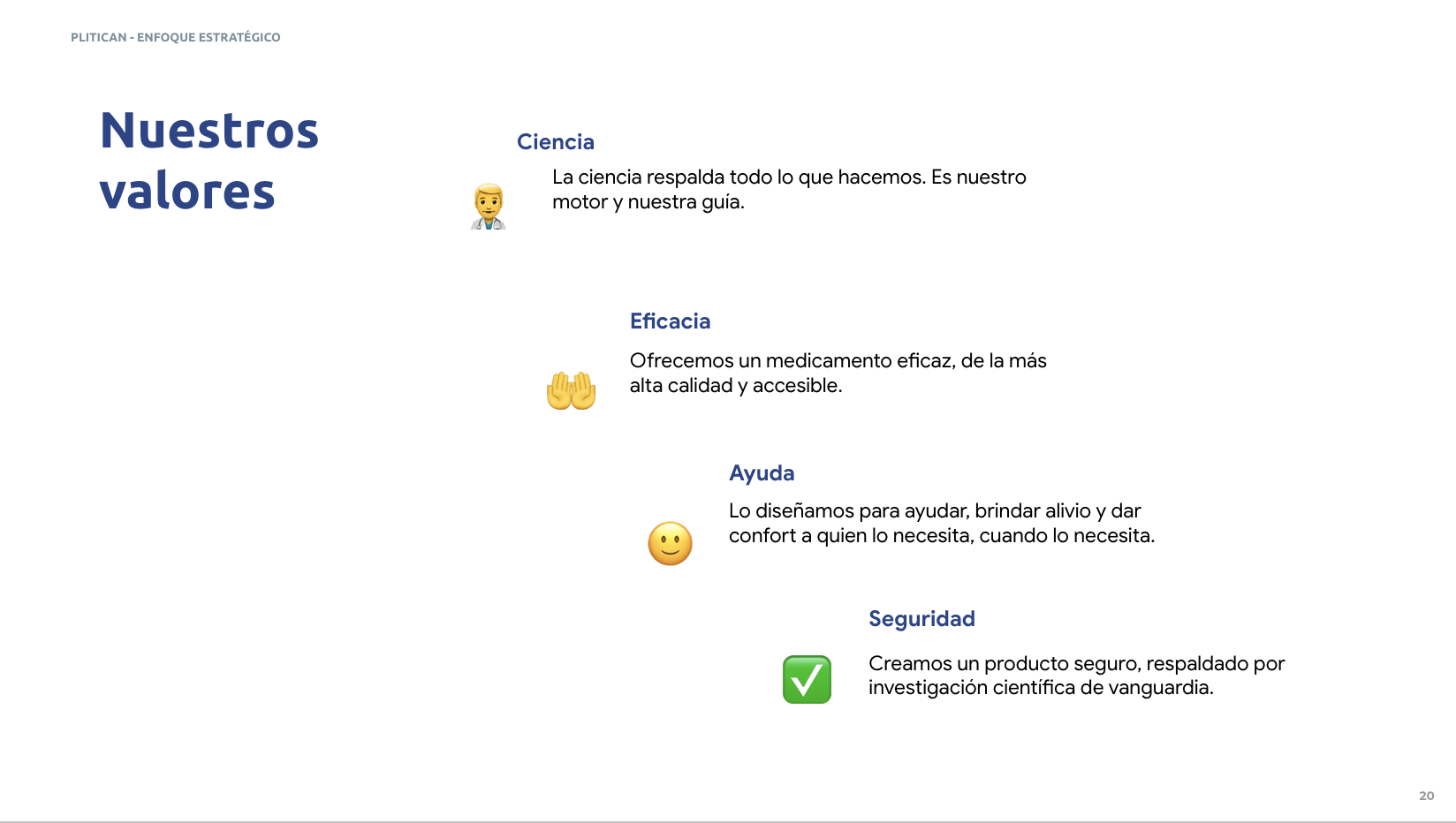
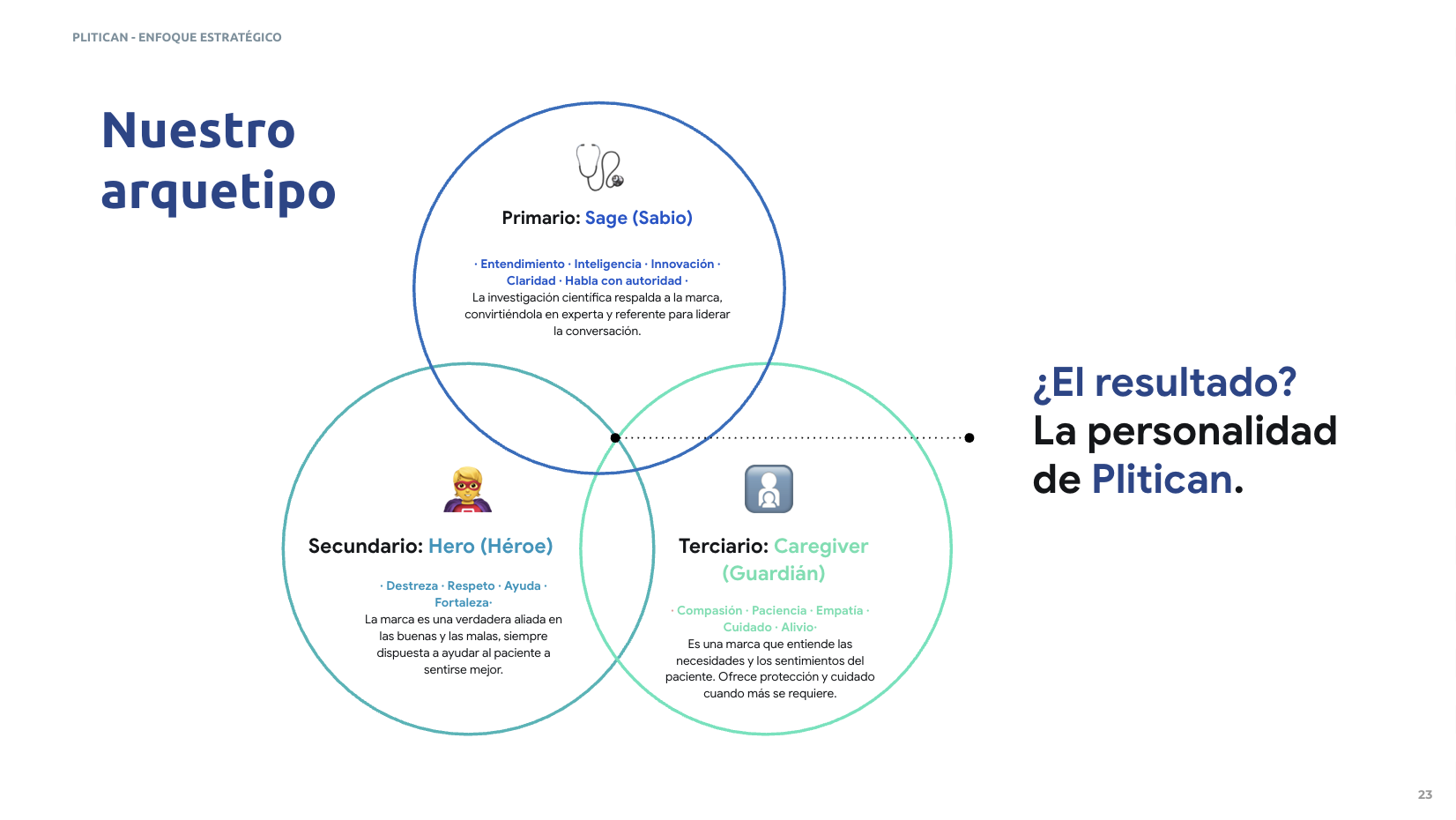
💊 Defined a brand archetype combining Sage, Hero and Caregiver: a brand that leads with scientific authority, but earns trust through reliability and genuine care for the patient
💊 Built a Brand Love Key tying product truth, human truth, functional and emotional benefit into a single point of view: Plitican exists to give people back healthier, fuller lives
💊 Set the tone of voice principles (close, expert, friendly, confident) against what to avoid (cold, amateur, conservative, insecure)
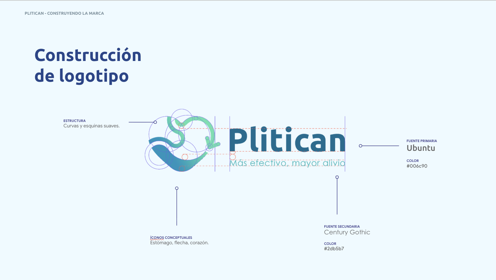
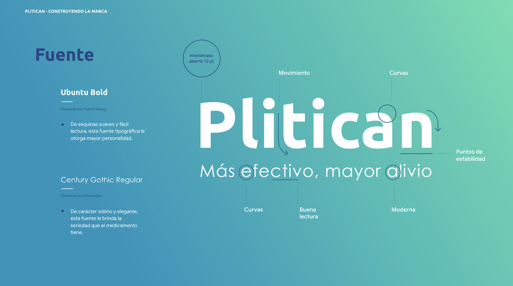
💊 Translated that strategy into a visual identity: a logo built from a stomach, a directional arrow and a heart, fused into a single mark, paired with a blue-and-turquoise palette chosen specifically for what each colour communicates (trust and calm from the blue, wellbeing and relief from the turquoise)
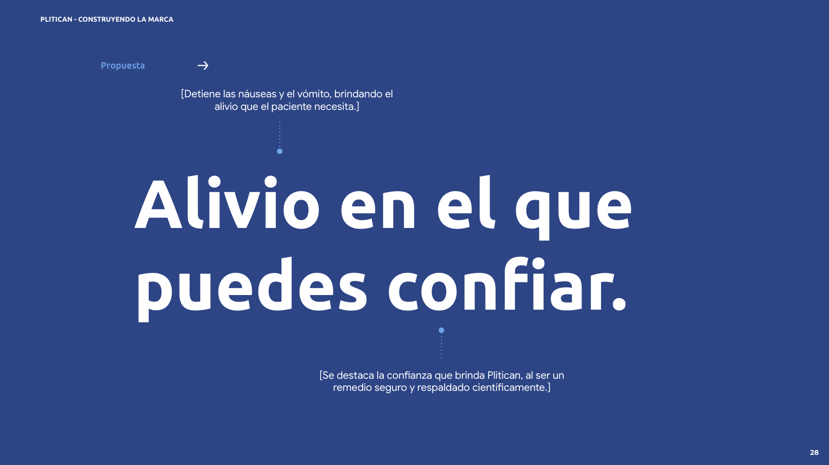
💊 Extended the system into a slogan ("Alivio en el que puedes confiar" — relief you can trust) and into the everyday tools the sales force would actually use: mailers, in-app banners, WhatsApp messaging templates
The Idea It Became
Alivio en el que puedes confiar. Relief you can trust.
Everything in the system was built to carry that one line. The logo's arrow doesn't just decorate the mark, it represents what the medication does inside the body: stopping things from coming back up, keeping relief where it needs to be. The heart isn't a generic warmth signal, it's there because Plitican's job is fundamentally about comfort, not just chemistry. Every element of the identity ties back to the same idea: this brand is allowed to be confident because the product has earned it, and confident enough to be the thing a doctor stakes their reputation on.
What Happened
The full identity system was developed and approved through to brand guidelines, including logo construction, colour and typography rules, tone of voice, and applied executions across mailing, app and WhatsApp formats. In the end, Sanofi chose not to proceed with the rebrand. That decision was about internal appetite for change at the time, not about the strategy or the system itself; the underlying brand architecture had done its job of giving Plitican a clear, defensible reason to exist in the minds of the people who needed to trust it.